How Canva Grew To 1 Million Users In 2 Years - Canva Marketing Strategies (11 min read)
Canva – an online graphic design platform used for creating posters, flyers, documents, social media graphics, and any other visuals. Its main advantage is that anyone can make a good design with this platform.

Canva History Timeline
- January 1, 2012 – Canva got founded by three Australian co-founders: Melanie Perkins, Cameron Adams, and Cliff Obrecht. It launches as beta, with a waiting list that gathered over 50,000 subscribers.
- Mar 2013 – $3M seed round, official launch.
- Jan 8, 2014 – 150,000 users
- Apr 16, 2014 – Guy Kawasaki, a famous technology expert, joins as the brand ambassador.
- Jul 22, 2014 – $3.6M funding in another round. Reaching 600,000 users. Releasing „Design” button
- October 2014 – 1 million users.
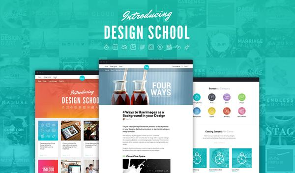
- Nov 6, 2014 – Online design school launch
- Nov 18, 2014 – Design marketplace for professional designers launch. In a blog note, it is stated that by this date, 437,000 designs were made weekly.
- Apr 10, 2015 – 2 million users, with an estimated 3600 new users daily and 111,111 new monthly users.
- May 4, 2015 – additional $6M funding round. Introducing „Canva Pro”, a premium
- Aug 2015 – 4 million users
- 2016-2017 financial year – Canva’s gross revenue went from $5.1M USD to $17.9M USD
- 2017 – Canva served 294,000 paying customers, achieving profitability with over 5 million users
- 2018 – 1 billion Australian dollar valuation (they hit 1 billion in USD shortly after)
- May 2019 – 1.9 billion USD
- October 2019 – 2.4 billion USD
- December 2019 – Canva for Education launch - for educational purposes
- Jun 2020 – Canva was valued at 4.5 billion USD
- 2021 – 30M monthly users
- Sep 2021 - Canva valued at 40 billion USD
How Canva got its first users?
Before Canva, there was Fusion Books.
Canva was the project of Melanie Perkins and Cliff Obrecht to help schools create quality yearbooks for students. While in college, Perkins earned extra money teaching design to other students. She saw that they needed a simple graphic design tool: printing brochures or posters was a problem. Melanies' mother was a teacher and was very involved with the school's yearbooks. This inspired Perkins to create a tool for designing yearbooks.
Melanie didn't know how to program, so she paid someone who could. She borrowed money from friends and hired freelancers. They made a website for called Fusion Books. There, students were able to design their own yearbooks together. Along with Obrecht, Perkins would print these books and deliver them to schools. Obrecht cold-called the schools to present the idea of Fusion Books. He changed his voice when the schools wanted to talk to the project director. They reached 400 schools. They came from the locals. They even sent some free samples of the designs. Perkins dropped out of school to concentrate on Fusion Books.
To promote Fusion Books (Canva), Perkins attended as many conferences and meetings as possible. She attended conferences for bloggers, designers, and social media marketers and then introduced Canva to attendees.
She and Obrecht also reached out to influential people in graphic design. She was asked to talk about Canva, so influencers recommended it to their followers.
During this time, Perkins attempted to raise funds and find investors for Canva. To date, Canva and Fusion Books worked separately.
Canva Fusion Books and Pivot
Is there a good startup story without a pivot? Melanie Perkins has built Fusion Books, an online design system for schools to create their yearbooks. It eventually grew to become Australia’s biggest yearbook publisher.
On that basis, Canva has been created, although since Fusion Books were profitable, these two companies operate in parallel.
Canva Waitlist
Perkins and Obrecht built a community around Canva and created a waitlist. It was all before Canva even started. Canva launched on a limited market of early adopters. They quickly grew to 50,000 on the waiting line and that rose immediately to 150,000 users after the platform has launched. With such numbers, outsiders want to get in and fuel the waiting list.
What made Canva so successful?
It was Canva’s simplicity that granted it success. In 2012, most design tools were already powerful and sophisticated, but that made them hard to use for new and casual users. Canva answered this pushing need, which allowed them to get users almost effortlessly. This was what they truly needed.
Easy to learn, easy to master
Melanie Perkins saw that the problem was not only in the tools that prevented people from making great designs – it was their belief that they couldn’t do it. Making the platform as easy to learn as it can be and offering great results in a matter of minutes became one of the most important goals.
Emotions of the UX
In order to do that, they designed Canva, so it was easy to play around. They spent months on perfecting the onboarding experience, and they paid a close attention to users’ emotional journey through the platform. They needed to feel good!
Jobs to be done framework
This framework is based on the idea that their customers attempt to accomplish particular tasks with their product. Those tasks are the “Jobs To Be Done.” For example, a task could be something like:
I want to create an Instagram ad without the disappointment of applying Photoshop.
In short, when using Canva, you will notice that every Canva matches the dire needs of the knowledge-hungry crowd. Canva enables its users to create any imaginable design in the world faster.
Canva Design button
Canva introduced a „Design” button to integrate on 3rd party websites quite quickly. In short, it allows plugging Canva into other sites and help users benefit from it. Among others, it is used by HubSpot.
Canva’s targeting
A broad target is often a headache. You don’t know who you’re talking to and can’t craft a message that would really resonate with the audience. Canva approached that by needs. It doesn’t matter if you’re a marketing or sales professional, or a student, if you need to design anything – Canva is for you.
Canva Goal-oriented keywords
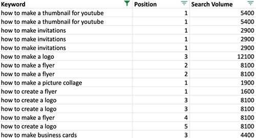
Canva uses clever targeting when it comes to SEO and search ads. They don’t bid much on keywords like „design tool” but they own cheaper keywords that are bound with design problems–like „color scheme.”
Canva Monetization
In order to become profitable, Canva introduced Canva Pro for the 200,000 companies that have been using the platform. This allows regular users to drive growth with the free version and boost revenue by offering services aimed at larger teams.
How did Canva grow so quickly?
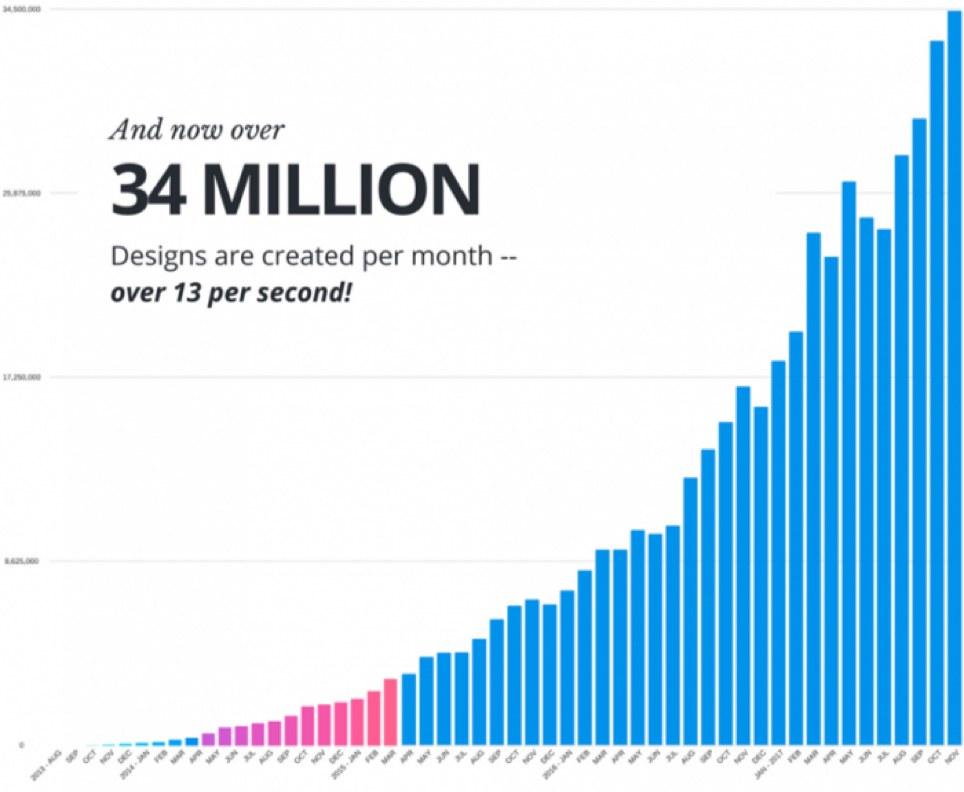
A large portion of the growth was word of mouth. When someone found the tool, most likely he liked it and shared with his circle. Since the tool was free, others could join instantly and then spread it further. There’s also a large community of Canva users that help to spread the love and share their designs with their friends.
Canva’s important choice that made it grow so quickly was also making it free. Tools like Photoshop are expensive but in Canva, there’s little to none friction for the buying decision. You can use it for free for the first time, fall in love with it and keep using it without paying a single penny.
Useful content
Canva’s content marketing focuses on solving design problems and achieving design goals–all for non-designers. This is why, for example, they have introduced the online design school–you can use great templates, but with Canva, you can also up your design game.

Reciprocity
People have a desire to give back. Canva provides a huge value to millions of people for free. This creates a desire to pay it back and fuels the growth through word of mouth. Sharing the tool with others is the least what happy users can do.
Scarcity
Scarcity could play a role in Canva’s early growth during the beta phase. You could see those cool designs but couldn’t get in–and this built demand.
Social proof
Word of Mouth usually links to the social proof. The community around Canva acts as evangelists, and if the message lands at their friends, they’ll be more willing to try it out.
Zero price effect
Canva has a free version that gives users have a high perceived value for their product. Since the free version has zero price, users tend to have a positive reaction towards the product. In return, Canva gains more traffic.
Flow state
Canva did a tremendous job at onboarding. You can play around or follow the onboarding program, but you won’t lose focus and stay in the flow state–a state in which you move through tasks without many distractions. With tools like Photoshop, a novice would fall out of the flow state to look for design tutorials, wonder how to complete what they’re trying to achieve, etc.
Affect Heuristic
People have a mental shortcut that influences their decisions based on the emotional state they are in. This is why the onboarding aimed at positive emotions is so powerful for Canva’s reception.
Occam’s Razor
When solving problems, “entities shouldn’t be multiplied without necessity”. In other words, the simplest solution is the best one. There were multiple tools for design but for the public, Canva, which is the simplest out there, seems to tick most of the boxes.

Many startups have been built around a problem that the customers weren’t aware of, or they didn’t care about them much. With Canva, that’s the opposite – they have found a mother lode in a real problem that affected millions of people. For that, they created a great solution and then brought it to market–but extraordinary products market themselves, through word of mouth. Another important decision was making it free.
What if you already have a product? Look for angles. You can still find a starving crowd for it, and the rest will be history.
Get your
"oh sh*t, this might work for us!"
moment in the next 5 minutes
Viral marketing case studies and marketing psychology principles that made hundreds of millions in months or weeks
In the first email:
- a step-by-step strategy that made $0-$30M within 9 weeks with $0 marketing budget (case study)
- cheatsheet (PDF) of 10 biases in marketing used by top 2% companies
Other than that:
- weekly original content that helps you STAND OUT by providing more perceived value with less work
(You won't find it anywhere else)

Explore Cognitive Biases in Marketing